
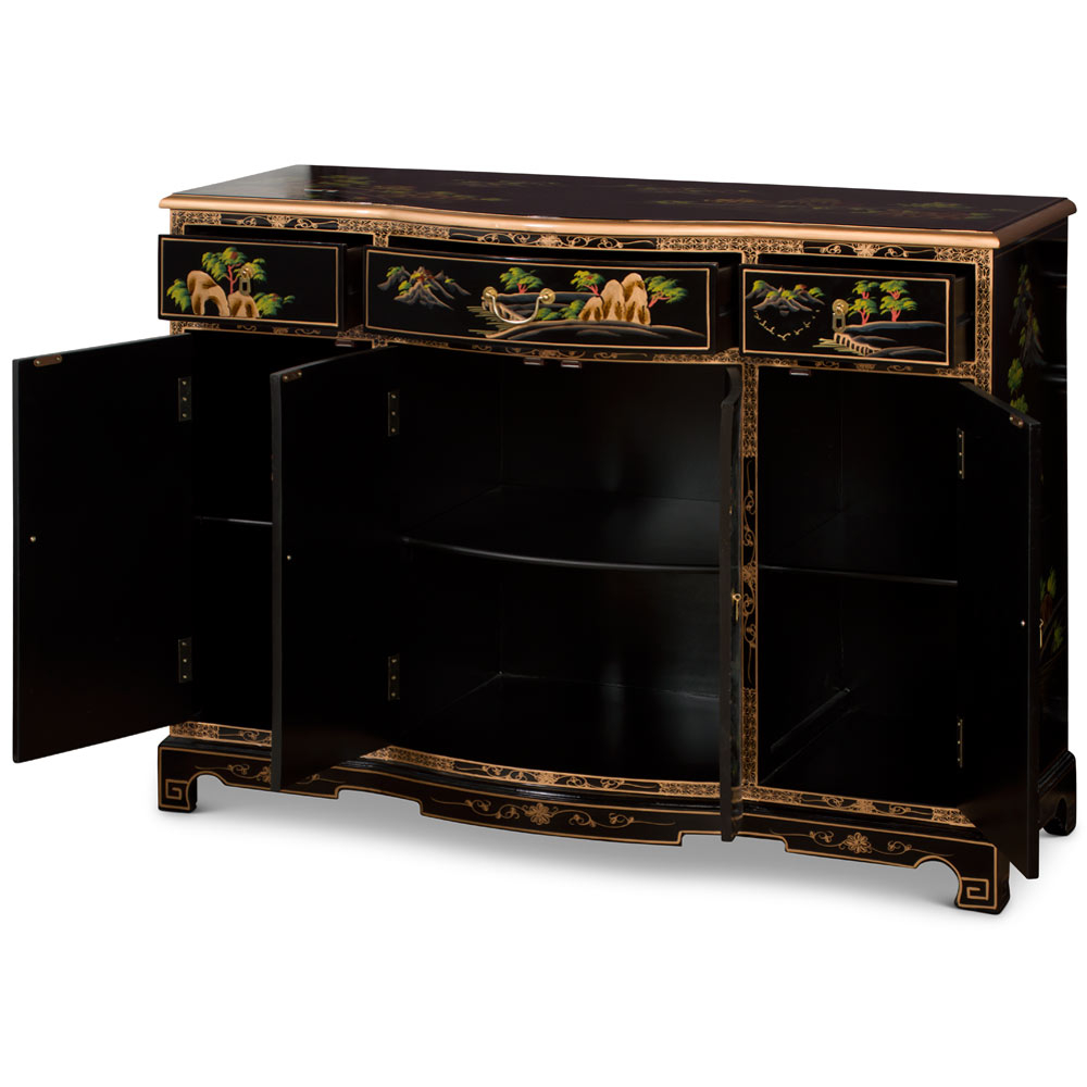
It sits there, quiet and commanding. A sixty-inch stretch of midnight gloss against a wall that might otherwise feel too empty, or perhaps, too busy. You’ve seen them in movies, those sleek, mysterious pieces that seem to hold secrets behind their doors. But in real life? In your actual living room in 2026? It’s not just about mystery. It’s about balance. It’s about taking something rooted in centuries of history and making it breathe in a space defined by clean lines and open concepts.
We often think of "Oriental" or East Asian design as something fragile, or strictly traditional. Think intricate carvings and heavy woods. But the black lacquer cabinet—specifically the modern interpretation of the classic xiaogui or sideboard—is different. It’s bold. It’s graphic. And if you’re trying to mix old-world charm with the minimalist vibe that’s still dominating interior trends this year, this piece is your secret weapon. It doesn’t just fit in; it anchors the whole room.
Let’s be honest, though. Putting a high-gloss, dark, traditional-style piece in a modern home can feel risky. Will it look like a museum exhibit? Will it clash with your beige sofa? Maybe. But only if you let it. When done right, that sixty inches of reflective surface becomes the bridge between two worlds. It’s where the past shakes hands with the present. And honestly? It’s easier than you think. You just need to know where to place it, and more importantly, what to put on top of it.
Understanding the Visual Weight of Gloss
Black lacquer isn’t just a color; it’s a texture. It’s a mood. In design terms, we talk about "visual weight," and nothing carries weight quite like a deep, reflective black. A matte black cabinet absorbs light. It recedes. But a lacquered one? It bounces light back. It demands attention. This is why the 60-inch size is so critical. It’s wide enough to be substantial, but not so massive that it overwhelms a standard apartment or mid-sized home. It’s the Goldilocks zone of statement furniture.
In 2026, our homes are still leaning heavily into the "warm minimalism" trend. We’ve moved past the sterile, all-white boxes of the early 2020s. People want warmth. They want soul. But they also love the clean look. A black lacquer cabinet fits this perfectly because it provides a sharp, clean line (the modern part) while offering depth and history (the traditional part). The gloss finish acts like a mirror, reflecting the room around it. This means the cabinet doesn’t just sit in the space; it interacts with the space. If you have a window opposite it, you get double the light. If you have a plant nearby, you get a ghostly, beautiful reflection of green against the black.
But here’s the catch: because it’s so visually heavy, you can’t crowd it. Imagine wearing a tuxedo to a beach party. It’s striking, but it needs room to breathe. Same with the cabinet. If you pack it full of knick-knacks, you lose the elegance. The lacquer finish is smooth, uninterrupted, and serene. Your styling needs to respect that silence. Think of the cabinet as a stage, not a storage unit. The doors hide the clutter (thank goodness), but the top and the front face are for show. Keep the area around it clear. Let the eye travel across that sixty-inch span without interruption. That’s where the luxury lives.
The Art of Contrast: Materials and Textures
So, you’ve got this shiny, hard, cold surface. What do you pair it with? If you put more shiny things on it, it looks like a showroom floor. Boring. The magic happens in the contrast. You need to soften the edge. Literally and figuratively. This is where natural materials come in to save the day. Wood, stone, linen, ceramic. These are the friends of lacquer.
Take wood, for instance. A light oak or walnut tray placed on top of the black lacquer creates an immediate warmth. The grain of the wood breaks up the monotony of the black. It says, "I’m modern, but I’m not cold." In recent years, we’ve seen a huge spike in mixing Japandi styles (that’s Japanese and Scandinavian, for the uninitiated) with traditional Chinese elements. A rough-hewn wooden bowl next to the sleek cabinet doors? Perfection. It highlights the craftsmanship of both. The lacquer shows off the precision of the finish; the wood shows off the beauty of imperfection.
Then there’s textiles. Don’t underestimate the power of a runner. But not just any runner. Avoid anything too glossy or synthetic. Go for raw silk, linen, or even a textured wool. A neutral-toned runner running the length of the sixty inches grounds the piece. It stops the cabinet from looking like it’s floating in space. It adds a layer of tactile comfort. Imagine running your hand along the cool lacquer, then touching the soft linen. That sensory experience is what makes a home feel lived-in. It’s about inviting touch.
And don’t forget stone. A marble or travertine vase. The coolness of stone complements the coolness of the lacquer, but the matte finish of the stone contrasts with the gloss. It’s a subtle dance of finishes. High gloss vs. matte. Hard vs. soft. Dark vs. light. When you layer these textures, you create a vignette that feels curated, not just assembled. It tells a story of intention. You didn’t just buy a cabinet; you built a moment.
Lighting the Darkness: Strategic Illumination
Lighting can make or break a black lacquer piece. Seriously. Put it in a dark corner with no light, and it becomes a void. A black hole in your decor. But light it correctly, and it becomes a jewel box. The goal isn’t to flood it with light. That’s too harsh. You want grazing light. You want shadows. You want drama.
Picture lighting is your best friend here. A small, adjustable spotlight mounted on the ceiling above the cabinet can wash the front face with light. This highlights the depth of the black. Lacquer isn’t flat black; it has layers. Good lighting reveals those layers. It makes the color look rich, like obsidian or deep water. In 2026, LED technology has gotten so good that you can get warm, dimmable spots that don’t emit heat. This is crucial because you don’t want to damage the finish over time. Keep the bulbs warm—around 2700K to 3000K. Cool white light will make the black look blue and cheap. Warm light makes it look expensive.
Alternatively, consider a table lamp placed on one end of the cabinet. But be careful with the scale. A tiny lamp will look lost on a sixty-inch surface. You need something with presence. A ceramic base with a linen shade works well. The light filtering through the shade casts a soft glow on the objects nearby, creating pools of light and shadow. It’s moody. It’s intimate. It turns the cabinet into a nighttime feature. During the day, the lamp is a sculptural object. At night, it’s a source of ambiance.
Avoid overhead downlights directly above if you can help them. They create glare on the glossy surface. Glare is the enemy of elegance. It’s distracting. If you have recessed lights in the ceiling, try to angle them away from the cabinet, or use baffles to cut the glare. You want to see the reflection of the room in the cabinet, not the blinding bulb. It’s a fine line, but when you get it right, the cabinet seems to glow from within. It becomes a beacon in the room.
Curating the Top: Less is More, Always
Now for the fun part. What goes on top? This is where most people mess up. They treat the surface like a shelf. They line up photos, books, candles, and random souvenirs. Stop. Breathe. Step back. A sixty-inch cabinet is a long canvas, but it’s not a billboard. You don’t need to fill every inch. In fact, empty space is your most powerful tool.
Start with the rule of three. It’s a classic design principle for a reason. Group items in odd numbers. It’s more dynamic. For a piece this wide, you might actually use two groups of three, or one large central grouping. Let’s say you place a tall vase on the left. Not in the corner, but slightly inward. Then, a stack of two large art books in the center. And finally, a small sculptural object on the right. This creates a visual triangle. Your eye moves from left to right, up and down. It’s engaging.
Height variation is key. If everything is the same height, it looks flat. Boring. You need vertical interest. That tall vase provides height. The books provide a mid-level block. The sculpture provides a low point. This rhythm keeps the eye moving. Don’t be afraid of negative space. Leave gaps between the objects. Let the black lacquer show through. That flash of black is what ties the arrangement together. It reminds you of the foundation.
Rotate your decor. Don’t let it sit there for years. Change it with the seasons. In spring, add a branch of cherry blossoms or magnolia. The organic shape against the rigid lines of the cabinet is stunning. In winter, maybe a simple pine cone arrangement or a metallic bowl. The cabinet is a constant; the decor is the variable. This keeps the space feeling fresh. It also allows you to experiment. Try different combinations. See what works. Design is not a one-and-done deal. It’s a conversation with your space.
Bridging Eras: Choosing the Right Accessories
The accessories you choose tell the story of the blend. You’re mixing traditional oriental aesthetics with contemporary decor. So, your objects should reflect that fusion. Don’t go full antique. Don’t go full modern. Find the middle ground. Look for pieces that have a traditional form but a modern material, or vice versa.
For example, a celadon vase is traditionally Chinese. But if you choose one with a very simple, geometric shape, it feels modern. Place it on the lacquer cabinet, and it bridges the gap. It honors the heritage of the cabinet while speaking the language of contemporary design. Or consider a bronze incense burner. Bronze is ancient. But a sleek, minimalist burner? That’s now. It’s about selecting objects that respect the past without being stuck in it.
Art is another great way to bridge the eras. Hang a piece of modern abstract art above the cabinet. Maybe a large canvas with bold strokes of red or gold. The red echoes the traditional lucky colors often found in Asian decor, but the abstract style is thoroughly modern. The black cabinet frames the art. It provides a dark backdrop that makes the colors pop. The sixty-inch width is perfect for balancing a large piece of art. Just make sure the art isn’t wider than the cabinet. It should be slightly narrower, or the same width. Never wider. That looks top-heavy.
Books are also great connectors. Choose coffee table books on Asian architecture, modern design, or nature. The covers themselves become part of the decor. Stack them horizontally to create platforms for smaller objects. It’s practical and pretty. And don’t forget the hardware on the cabinet itself. If the cabinet has traditional brass pulls, keep them. They add a touch of vintage warmth. If it’s handle-less, keep it sleek. Don’t add hardware just for the sake of it. Let the design speak for itself.
Let’s talk reality. Black lacquer is beautiful, but it’s high maintenance. It shows everything. Dust. Fingerprints. Smudges. If you have kids or pets, you know the struggle. But don’t let that scare you away. With the right care, it stays stunning. And honestly, the ritual of caring for it can be quite meditative. It forces you to slow down and pay attention to your home.
First rule: microfiber cloths only. Paper towels scratch. Old rags might have dirt embedded in them. Get a good quality, plush microfiber cloth. Keep it dedicated to the cabinet. Don’t use it on the kitchen counter. Second rule: dry dusting first. Always remove the loose dust before you wipe. If you wipe a dusty surface, you’re just grinding the dust into the finish. That’s how you get micro-scratches. Over time, those scratches dull the gloss.
For smudges, use a tiny bit of water. Or a specialized lacquer cleaner. Avoid household cleaners with ammonia or alcohol. They can strip the finish. Spray the cleaner on the cloth, not directly on the cabinet. You don’t want liquid seeping into the seams. Wipe gently. Follow the grain if there is one, though lacquer is often uniform. Buff it dry immediately. That’s the secret to the shine. The buffing brings out the depth.
Placement matters too. Keep the cabinet out of direct sunlight. UV rays can yellow the lacquer over time. Or fade it. Neither is good. If it’s near a window, use sheer curtains to diffuse the light. Also, watch the humidity. Extreme changes in humidity can cause the wood underneath to expand and contract, which might crack the lacquer. Keep your home at a stable temperature and humidity level. It’s good for you, and it’s good for your furniture.
In the end, the care you give the piece reflects the value you place on it. It’s not just a box. It’s a centerpiece. It’s a work of art. Treating it with respect ensures it lasts. And in a world of fast furniture, having something that lasts is a radical act. It’s a commitment to quality. To beauty. To the blend of old and new that makes your home uniquely yours. So take the time. Wipe it down. Admire the reflection. Enjoy the silence it brings to your space.


