
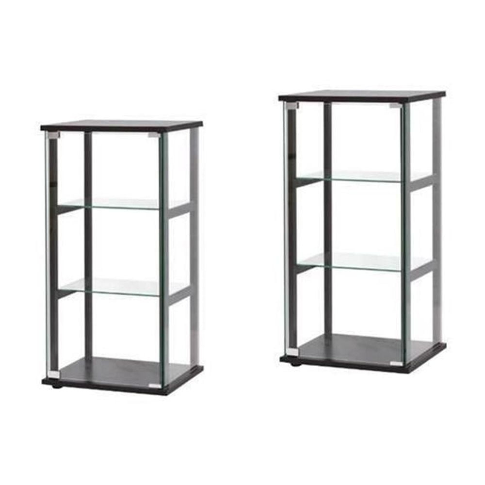
There is something deeply satisfying about order. Not the rigid, sterile kind that makes you afraid to breathe, but the soft, rhythmic balance that lets your eyes rest. You walk into a room and feel it before you see it. It’s that quiet hum of symmetry. In small spaces, where every inch fights for attention, this balance isn’t just nice—it’s essential. And right now, in 2026, the trend isn’t just about having a display case. It’s about the power of two. Specifically, two sleek, black curio cabinets standing like sentinels in a tight corner or flanking a narrow window.
Why black? Why two? And how do you pull it off without turning your cozy apartment into a gothic dungeon? It’s a question many of us ask when staring at blank walls that feel too big for one piece but too small for a whole suite. The answer lies in the interplay of shadow and light, weight and air. Black absorbs the visual noise of a cluttered room, while glass reflects the light, creating an illusion of depth. When you double down on this effect, you create a anchor. A focal point that doesn’t shout, but whispers with authority.
Let’s be honest. Decorating a small space is hard. You want to show off your grandma’s vintage teacups, your collection of sea glass, or those weird little figurines you found in Tokyo. But you don’t want the room to feel cramped. This is where the dual cabinet strategy shines. It turns a limitation into a design feature. It’s not just about storage; it’s about framing your life in a way that feels intentional. Ready to dive in? Let’s explore how to make this work in your home.
The Psychology of Pairing in Tight Quarters
Symmetry is comforting. Our brains are wired to seek patterns, and nothing says pattern like a mirror image. In a compact living room or a narrow hallway, a single large piece of furniture can feel lopsided. It pulls the eye to one side, making the other side feel empty and awkward. But place two identical items—like black curio cabinets—on either side of a central axis, and suddenly, the room stabilizes. It feels grounded. This is especially true with dark finishes. Black is heavy visually. One black cabinet in a small, light-filled room might look like a mistake, a dark blotch. Two of them? They become a deliberate design choice.
Think of it like bookends. You wouldn’t put a bookend on only one side of a shelf, right? The books would slide off. In interior design, these cabinets act as visual bookends for your space. They frame whatever sits between them—a fireplace, a console table, a window seat, or even just a blank wall with a piece of art. This framing effect draws the eye inward, making the space between the cabinets feel more significant and spacious than it actually is. It’s a trick of perspective that has been used by architects for centuries, but it works just as well in a 500-square-foot studio in 2026.
The choice of black adds another layer to this psychological comfort. Black is grounding. In a world that often feels chaotic and fast-paced, coming home to a space that feels anchored can lower stress levels. The deep, matte or satin finish of modern black cabinets (popularized by brands like AllModern and Ashley Furniture in recent years) absorbs light rather than reflecting it harshly. This reduces visual clutter. When you have two of these voids in your room, they create pockets of calm. Your eyes skip over the busy details of the room and rest on the solid, symmetrical forms. It’s a subtle shift, but you’ll feel the difference.
Choosing the Right Silhouette for Small Footprints
Not all curio cabinets are created equal. In fact, picking the wrong shape can ruin the symmetry you’re trying to achieve. For compact spaces, profile is everything. You need slim lines. Bulky, ornate Victorian-style cabinets with thick molding and deep bases will eat up your floor space and make the room feel smaller. Instead, look for mid-century modern influences or contemporary minimalist designs. Think verticality. Tall, narrow cabinets draw the eye upward, emphasizing ceiling height rather than floor area. This is a crucial distinction in small apartments where square footage is limited but vertical space is often wasted.
Glass selection matters too. In 2026, textured glass is having a moment. While clear glass offers maximum visibility, it also shows every fingerprint and dust mote. Frosted, ribbed, or reeded glass adds a layer of privacy and texture. It softens the contents inside, turning your collection into a blur of color and shape rather than a chaotic jumble of objects. This is particularly helpful if your collection is eclectic and doesn’t perfectly match. The black frame provides the structure, while the textured glass provides the mystery. Plus, as noted by designers on Foter, slim profiles with glass doors maximize visibility without overwhelming the tight space.
When shopping, pay attention to the depth. Standard curio cabinets can be 14 to 18 inches deep. In a narrow hallway or a small living nook, even two inches matter. Look for "slim" or "narrow" specific models. Many retailers now offer cabinets that are only 10-12 inches deep. These are perfect for displaying plates, small sculptures, or books without protruding too far into the walkway. Also, consider the base. Cabinets with raised legs (mid-century style) allow light to pass underneath, making them feel lighter and less imposing than those that sit flat on the floor. This "floating" effect is key to keeping the room feeling airy despite the dark color.
Placement Strategies That Maximize Flow
Where you put these cabinets is just as important as what they are. The most classic symmetrical arrangement is flanking a central feature. If you have a fireplace, even a fake one, placing a black curio on each side creates an instant formal look. But what if you don’t have a fireplace? No problem. You can flank a window. This turns the window into a picture frame, with the cabinets as the border. The natural light from the window will hit the glass doors, creating sparkles and reflections that break up the solidity of the black wood. It’s dynamic and changes throughout the day.
Another clever spot is the entryway. In many compact homes, the foyer is narrow and awkward. Placing two slim black cabinets on opposite walls (if width allows) or side-by-side against a long wall can define the space. If placed side-by-side, ensure there is a small gap between them, or use a thin console table in the middle to bridge the gap. This creates a gallery wall effect in three dimensions. Just be careful not to block the path. In tight spaces, flow is king. You should be able to walk past them without brushing your shoulder against the glass. Measure twice, buy once.
Corner placement is tricky with symmetry. True symmetry usually requires a central axis. However, you can create "balanced asymmetry" in corners. For example, place one cabinet in the corner and the other on the adjacent wall, equidistant from the corner. Then, use a tall plant or a floor lamp in the corner to bridge the two. It’s not perfect mirror symmetry, but it feels balanced. Alternatively, if you have two corners facing each other across a small room, you can place one cabinet in each corner. This draws the eye across the room, expanding the perceived width. It’s about creating a dialogue between the two pieces, even if they aren’t directly opposite.
Lighting: The Secret Ingredient for Drama
A black cabinet in a dark corner is a black hole. You won’t see your treasures, and the cabinet will just look like a lump of shadow. Lighting is non-negotiable here. In 2026, integrated LED lighting is standard in many higher-end curio cabinets, but you can easily retrofit older or simpler models. The goal is to illuminate the contents, not the cabinet itself. Use puck lights or LED strips on the underside of each shelf. Warm white light (2700K-3000K) is best for creating a cozy, inviting glow. Cool white light can make black furniture look harsh and clinical.
Consider external lighting too. As Jill Franks mentioned in House Digest, hidden lights or sconces can enhance small spaces. Place a small, directional spotlight on top of each cabinet, aimed slightly downward into the glass. This creates a pool of light that highlights the top shelf and casts interesting shadows. If you have wall space above the cabinets, a pair of matching sconces can tie the whole vignette together. The light bouncing off the glass doors will add depth and sparkle. It turns the cabinets into lanterns at night, adding ambiance to the room.
Don’t forget about the reflection. Black glass or high-gloss black finishes will reflect the light sources in the room. Use this to your advantage. Position the cabinets so they reflect a beautiful view, a piece of art, or a nice lamp. Avoid reflecting cluttered areas or messy corners. The reflection becomes part of the display. If you use sensor-activated lighting (available on Amazon and other retailers), the cabinets will glow softly when you walk by, adding a touch of magic and functionality. It’s a small detail that makes a big impact on the user experience.
Curating Collections for Visual Harmony
Now for the fun part: filling them up. But wait. Don’t just shove everything in there. Symmetry outside needs balance inside. You don’t need to mirror the contents exactly—that looks staged and boring. Instead, aim for visual weight balance. If the left cabinet has a tall vase on the top shelf, the right cabinet could have a stack of books or a group of smaller objects that occupy the same amount of visual space. Think in terms of triangles and clusters. Group items in threes. Vary heights. Leave negative space. Empty space is just as important as the objects.
Color coordination is key with black cabinets. The black frame acts as a neutral backdrop, so almost any color will pop. However, too many colors can look chaotic. Pick a palette. Maybe it’s white and blue ceramics. Or brass and green plants. Or earthy tones with terracotta. Stick to 2-3 main colors for a cohesive look. Metallic accents like gold, brass, or copper look stunning against black. They catch the light and add a touch of luxury. Glass and crystal items also work well because they reflect light and don’t add visual weight.
Rotation is your friend. As suggested by experts, institute a rotation of features. You don’t need to display everything at once. Swap out items seasonally or whenever you feel bored. This keeps the display fresh and gives you a reason to revisit your collections. In small spaces, less is more. Overstuffing the cabinets makes them look cluttered and defeats the purpose of the glass doors. Aim for 50-60% fullness. Let each item breathe. Tell a story with each shelf. Maybe the bottom shelf holds heavier books, the middle holds your favorite curios, and the top holds delicate, light items.
Black shows dust. It’s a fact of life. Fingerprints on glass are inevitable. To keep your symmetrical duo looking sharp, establish a cleaning routine. Use a microfiber cloth and a gentle glass cleaner. Avoid abrasive cleaners that can scratch the finish. For the black wood or metal, a damp cloth followed by a dry one is usually enough. If you have matte black finishes, be extra gentle, as they can show streaks if rubbed too hard. Keeping the glass clean is crucial because the transparency is what makes the cabinets feel light. Dirty glass makes them look heavy and neglected.
Re-evaluate your arrangement every few months. Does it still feel balanced? Has the light in the room changed? Did you acquire new pieces that need a home? Symmetry is not a set-it-and-forget-it deal. It’s a living design element. Adjust the shelves if they are adjustable. Change the height of your displays to keep the eye moving. If you find one cabinet looking heavier than the other, swap some items around. It’s a low-stakes way to refresh your room without buying new furniture.
Finally, enjoy the process. The art of symmetry is not about perfection. It’s about intention. It’s about creating a space that feels good to you. Whether you display vintage cameras, rare books, or family heirlooms, the dual black curio cabinets provide a stage for your personal history. They anchor your small space, add drama, and offer a sense of order in a chaotic world. So go ahead. Find your pair. Light them up. And let your treasures shine.
In the end, it’s not just about the cabinets. It’s about how they make you feel when you walk into the room. That sense of calm. That sense of pride. That sense of home. Symmetry soothes the soul. And in a small space, it’s the ultimate luxury.


