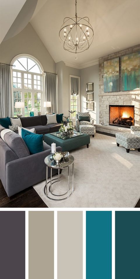
Hey there, design lovers! Get ready to dive into the mesmerizing world of color and explore what’s hot for our living rooms in 2025. We’re talking about hues that not only look great but also evoke feelings, tell stories, and make your home truly you. Forget fleeting fads; these trends are about creating spaces that are both beautiful and livable. It’s all about crafting a space that makes you feel great every day.
The living room is often the heart of a home, a place where we unwind, connect with loved ones, and express our personal style. And color? Well, color is the language that speaks to our emotions and sets the mood. Choosing the right colors can transform a dull space into a vibrant sanctuary, a chaotic area into a calming oasis. As we look ahead to 2025, it’s time to consider how we can use color to create living rooms that are not only stylish but also deeply personal and functional, and also reflect what we’re all about! I mean, what’s cooler than that. This article is all about that!
Earthy Grounding: The Rise of Warm Neutrals and Nature-Inspired Tones
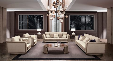
Say goodbye to stark, cold grays and hello to warm, inviting neutrals! Think creamy beiges, sandy tans, and rich browns that evoke feelings of comfort, stability, and connection to the earth. These colors are incredibly versatile, creating a beautiful backdrop for pops of bolder hues and natural textures.
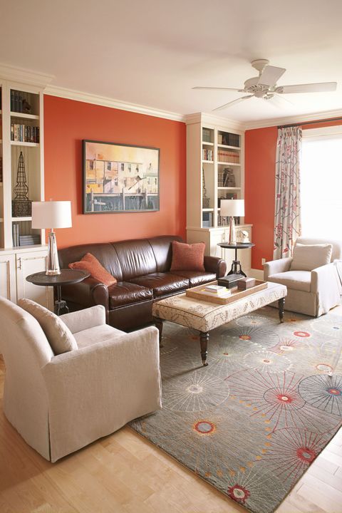
- Example: A living room with walls painted in a warm beige, paired with a brown leather sofa, wooden furniture, and pops of green through plants.
These tones are all about embracing the beauty of the natural world. We’re seeing a surge in popularity for colors like olive green, terracotta, and deep blues that mimic the shades of forests, deserts, and oceans. These colors bring a sense of tranquility and serenity to the space, creating a calming retreat from the outside world. It’s like a big warm hug for your eyes!
- Tip: Pair earthy tones with natural materials like wood, stone, and linen to enhance the organic feel.
Bold and Optimistic: Embracing Joyful and Energetic Colors
While neutrals will continue to be a popular choice, 2025 will also see a rise in bold, optimistic colors that inject personality and energy into our living rooms. Think vibrant yellows, cheerful oranges, and playful pinks that uplift the spirit and create a sense of fun. These colors are perfect for those who want to make a statement and express their individuality.
- Example: A living room with a bright yellow accent wall, paired with a gray sofa and colorful throw pillows.
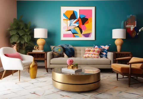
Don’t be afraid to experiment with unexpected color combinations! Try pairing a bold pink with a deep green, or a vibrant orange with a calming blue. The key is to find colors that you love and that make you feel happy. And who doesn’t want to be happy? These colors are about injecting a bit of sunshine into our lives, even on the cloudiest of days. It’s a chance to be playful, expressive, and to create a space that truly reflects your unique personality.
- Tip: Use bold colors sparingly as accent colors to avoid overwhelming the space.
The Power of Pastels: Soft and Serene Hues for a Calming Atmosphere
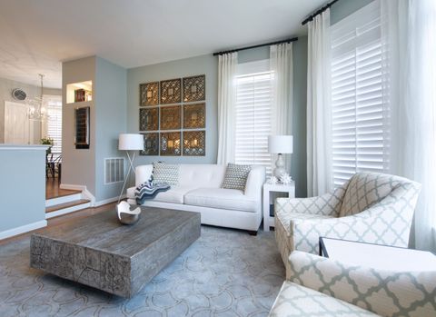
For those seeking a more tranquil and serene living room, pastels will continue to be a popular choice in 2025. Think soft blues, gentle greens, and delicate pinks that create a calming and relaxing atmosphere. These colors are perfect for creating a space where you can unwind and de-stress after a long day. I like this one alot.
- Example: A living room with walls painted in a soft blue, paired with a white sofa and pastel-colored cushions.
Pastels are incredibly versatile and can be used in a variety of ways. Use them as the main color for your walls, or incorporate them through furniture, accessories, and artwork. They work particularly well in rooms with lots of natural light, creating a bright and airy feel.
- Tip: Combine pastels with natural materials like wood and linen to add warmth and texture to the space.
Jewel Tones Reign: Adding Richness and Depth to Your Living Room
If you’re looking to add a touch of luxury and sophistication to your living room, jewel tones are the way to go. Think emerald green, sapphire blue, ruby red, and amethyst purple – colors that are rich, vibrant, and full of depth. These colors can instantly elevate the look and feel of your space, creating a sense of opulence and drama.
- Example: A living room with walls painted in emerald green, paired with a velvet sofa and gold accents.
Jewel tones work particularly well in rooms with good lighting, as they can really shine and showcase their depth. Use them as the main color for your walls, or incorporate them through furniture, accessories, and artwork. A deep blue sofa against a light backdrop can look amazing!
- Tip: Use jewel tones sparingly as accent colors to avoid making the space feel too dark.
Monochromatic Magic: Creating Harmony with Different Shades of the Same Color
A monochromatic color scheme involves using different shades and tones of the same color to create a harmonious and cohesive look. This is a great option for those who want a simple yet stylish living room that feels both relaxing and sophisticated. This is one of my favorite looks.
- Example: A living room with walls painted in a light gray, paired with a darker gray sofa, charcoal-colored cushions, and silver accents.
The key to a successful monochromatic color scheme is to vary the textures and materials to add interest and prevent the space from feeling flat. Use different shades of the same color on your walls, furniture, and accessories to create a layered and dimensional look.
- Tip: Add pops of metallic accents to add a touch of glamour to a monochromatic space.
Beyond the Walls: Considering Undertones and Lighting
Choosing the right color isn’t just about picking a shade you like; it’s about understanding undertones and how they interact with light. Every color has an undertone – warm (yellow, orange, red) or cool (blue, green, purple) – and this undertone can significantly impact how the color looks in your space.
- Example: A warm white paint might have a yellow undertone, making it appear creamier and cozier, while a cool white paint might have a blue undertone, making it appear crisper and brighter.
Consider the amount of natural light your living room receives. North-facing rooms tend to have cooler light, while south-facing rooms tend to have warmer light. Choose colors that complement the natural light in your space to create a balanced and harmonious atmosphere. If a room is dark, adding a dark color could make it feel even smaller.
- Tip: Test paint samples in your living room at different times of the day to see how the color looks in different lighting conditions.
As we journey into 2025, the world of living room colors is brimming with exciting possibilities. From the grounding warmth of earthy neutrals to the joyful energy of bold hues, there’s a color palette to suit every style and personality. Remember, the most important thing is to choose colors that you love and that make you feel happy and comfortable in your own home. Don’t be afraid to experiment, have fun, and let your creativity shine! Create a space that truly reflects you and is a place that you want to hang out in, and that you’re proud of. Happy decorating.

